要让一个div中的子div居中,可以通过多种CSS技术实现,具体方法取决于布局需求(水平居中、垂直居中或同时居中)和浏览器兼容性要求,以下是详细的解决方案,包括传统方法、现代布局技术(Flexbox和Grid)以及特殊场景的处理技巧。

水平居中方法
使用margin: 0 auto(适用于已知宽度的块级元素)
当子div是块级元素(如display: block)且宽度已知时,通过设置左右外边距为auto,可使子div在父div中水平居中。
代码示例:
.parent {
  width: 500px;
  height: 300px;
  border: 1px solid #ccc;
}
.child {
  width: 200px;
  height: 100px;
  background: #f0f0f0;
  margin: 0 auto; /* 关键代码 */
}
注意事项:
- 子div必须明确设置宽度(或
max-width)。 - 父div需设置
text-align: center时,若子div是行内元素(如display: inline-block),则需通过父元素控制居中。
使用text-align: center(适用于行内或行内块级元素)
若子div是行内元素(如display: inline-block),可通过父元素的text-align属性实现水平居中。
代码示例:
.parent {
  text-align: center;
  width: 500px;
  height: 300px;
  border: 1px solid #ccc;
}
.child {
  display: inline-block;
  width: 200px;
  height: 100px;
  background: #f0f0f0;
}
缺点:

- 会影响父容器内其他行内元素的排列(如文本、图片等)。
- 需要额外清除
text-align对子元素的继承影响。
使用Flexbox(现代推荐方法)
Flexbox提供更灵活的布局方式,通过设置父容器的justify-content: center即可实现子元素水平居中。
代码示例:
.parent {
  display: flex;
  justify-content: center;
  width: 500px;
  height: 300px;
  border: 1px solid #ccc;
}
.child {
  width: 200px;
  height: 100px;
  background: #f0f0f0;
}
优势:
- 子元素无需设置固定宽度,可自适应内容。
- 支持多子元素同时居中,且不影响其他布局属性。
垂直居中方法
使用line-height(适用于单行文本或高度已知的元素)
若子div是单行文本或高度与父div一致,可通过设置line-height等于父容器高度实现垂直居中。
代码示例:
.parent {
  height: 300px;
  line-height: 300px;
  border: 1px solid #ccc;
}
.child {
  height: 100px;
  background: #f0f0f0;
}
局限性:

- 仅适用于子元素高度与
line-height匹配的场景。 - 多行文本或高度不固定时效果不佳。
使用Flexbox(垂直居中的最佳实践)
通过Flexbox的align-items: center属性,可轻松实现子元素的垂直居中。
代码示例:
.parent {
  display: flex;
  align-items: center;
  justify-content: center; /* 同时实现水平居中 */
  width: 500px;
  height: 300px;
  border: 1px solid #ccc;
}
.child {
  width: 200px;
  height: 100px;
  background: #f0f0f0;
}
优势:
- 同时支持水平和垂直居中。
- 子元素高度可动态变化,无需固定值。
使用Grid布局(现代替代方案)
Grid布局同样支持居中,通过place-items: center可一次性设置水平和垂直居中。
代码示例:
.parent {
  display: grid;
  place-items: center;
  width: 500px;
  height: 300px;
  border: 1px solid #ccc;
}
.child {
  width: 200px;
  height: 100px;
  background: #f0f0f0;
}
适用场景:
- 适合二维布局(如表格、卡片网格)。
- 与Flexbox类似,但更适合复杂布局结构。
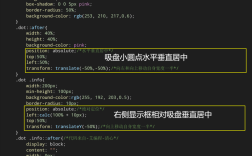
使用绝对定位与transform(传统兼容方案)
通过绝对定位将子元素移至父容器中心,再通过transform调整位置。
代码示例:
.parent {
  position: relative;
  width: 500px;
  height: 300px;
  border: 1px solid #ccc;
}
.child {
  position: absolute;
  top: 50%;
  left: 50%;
  transform: translate(-50%, -50%);
  width: 200px;
  height: 100px;
  background: #f0f0f0;
}
注意事项:
- 父元素需设置
position: relative。 transform可能影响性能(尤其是在动画中)。
特殊场景处理
子元素宽度不固定时的居中
若子元素宽度由内容决定(如文本),可结合Flexbox或inline-block实现:
.parent {
  display: flex;
  justify-content: center;
}
.child {
  white-space: nowrap; /* 防止文本换行 */
}
多个子元素的居中排列
使用Flexbox的justify-content和align-items可同时居中多个子元素:
.parent {
  display: flex;
  flex-wrap: wrap;
  justify-content: center;
  align-items: center;
}
响应式设计中的居中
结合媒体查询调整父容器或子元素的尺寸,确保居中效果在不同屏幕下保持一致。
@media (max-width: 600px) {
  .parent {
    width: 100%;
  }
  .child {
    width: 80%;
  }
}
方法对比与选择建议
| 方法 | 水平居中 | 垂直居中 | 同时居中 | 兼容性 | 推荐场景 |
|---|---|---|---|---|---|
margin: 0 auto |
IE8+ | 固定宽度块级元素 | |||
text-align |
IE6+ | 行内元素 | |||
| Flexbox | IE11+ | 现代布局(首选) | |||
| Grid | IE11+ | 二维网格布局 | |||
绝对定位+transform |
IE9+ | 兼容旧版浏览器 |
选择建议:
- 优先使用Flexbox或Grid,代码简洁且功能强大。
- 需兼容IE8以下浏览器时,采用
margin或绝对定位方案。 - 单行文本居中优先考虑
line-height。
常见错误与解决方案
- 子元素未居中:检查父容器是否设置了
display: flex或position: relative。 - 居中后布局错乱:避免在子元素上设置
float或position: absolute(除非特殊需求)。 - 响应式失效:确保媒体查询中重置了关键样式(如
width、margin)。
相关问答FAQs
Q1: 为什么使用margin: 0 auto后子元素仍未水平居中?
A: 可能的原因包括:
- 子元素未设置明确宽度(如
width: 100%会导致auto失效)。 - 父容器有浮动或绝对定位(需清除浮动或设置
position: relative)。 - 子元素被
float影响(需移除float属性)。
Q2: Flexbox和Grid在居中应用中有什么区别?
A: Flexbox更适合一维布局(如单行/单列居中),通过justify-content和align-items控制;Grid则更适合二维布局(如表格、网格),通过place-items或grid-template-columns等属性实现更复杂的居中需求,Grid可直接将子元素定位到特定网格单元的中心,而Flexbox更依赖轴对齐。