要让div在页面中居中,可以通过多种CSS技术实现,具体方法取决于布局需求(水平居中、垂直居中或同时居中)和浏览器兼容性要求,以下是详细的技术分析和实践方案,包含不同场景下的代码示例和注意事项。

水平居中方法
使用margin: 0 auto(适用于已知宽度的块级元素)
当div的宽度固定时,通过设置左右margin为auto,浏览器会自动分配剩余空间,实现水平居中,需确保div为块级元素(display: block或inline-block)。
.center-div {
    width: 300px;
    margin: 0 auto;
}
注意:此方法不适用于浮动(float)或绝对定位(position: absolute)的元素。
使用Flexbox(现代布局推荐)
Flexbox是CSS3提供的弹性布局方案,能灵活实现各种居中效果,在父容器上设置display: flex,并添加justify-content: center即可。
.parent {
    display: flex;
    justify-content: center;
}
.center-div {
    /* 无需设置宽度,自适应内容 */
}
优势:支持子元素动态调整,可同时处理水平垂直居中(结合align-items: center)。

使用Grid布局
Grid布局同样支持简洁的居中语法,适合二维布局场景。
.parent {
    display: grid;
    place-items: center; /* 同时控制水平和垂直居中 */
}
垂直居中方法
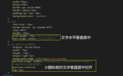
使用line-height(适用于单行文本)
若div高度固定且只包含单行文本,可通过设置line-height等于height实现垂直居中。
.center-div {
    height: 50px;
    line-height: 50px;
}
局限:仅适用于文本内容,多行文本会溢出。
使用Flexbox垂直居中
在Flexbox容器中,通过align-items: center属性实现垂直居中。

.parent {
    display: flex;
    align-items: center;
}
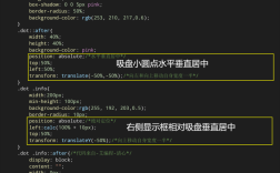
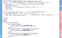
使用绝对定位+transform(兼容性较好)
通过绝对定位将div向上移动50%,再通过transform: translateY(-50%)修正自身高度偏移。
.parent {
    position: relative;
    height: 200px; /* 需明确父容器高度 */
}
.center-div {
    position: absolute;
    top: 50%;
    transform: translateY(-50%);
}
水平垂直同时居中
Flexbox方案(最推荐)
.parent {
    display: flex;
    justify-content: center;
    align-items: center;
    min-height: 100vh; /* 确保父容器占满视口高度 */
}
Grid方案
.parent {
    display: grid;
    place-items: center;
    min-height: 100vh;
}
绝对定位+transform
.parent {
    position: relative;
    height: 100vh;
}
.center-div {
    position: absolute;
    top: 50%;
    left: 50%;
    transform: translate(-50%, -50%);
}
Table-cell方案(兼容IE8+)
通过将父容器模拟为表格单元格,利用vertical-align属性居中。
.parent {
    display: table-cell;
    vertical-align: middle;
    text-align: center;
}
.center-div {
    display: inline-block;
}
不同场景下的选择建议
| 场景 | 推荐方法 | 优点 | 缺点 |
|---|---|---|---|
| 固定宽度水平居中 | margin: 0 auto | 简单直观 | 需明确宽度 |
| 响应式布局 | Flexbox/Grid | 灵活适配 | 旧浏览器需前缀 |
| 父容器高度未知 | Flexbox | 无需指定高度 | 需现代浏览器支持 |
| 需兼容IE8 | Table-cell/绝对定位 | 兼容性好 | 代码较冗长 |
注意事项
- 清除默认样式:部分浏览器默认body有margin,需先重置(
* { margin: 0; })。 - 高度继承问题:使用绝对定位时,父容器需设置position: relative且明确高度。
- Flexbox兼容性:IE10及以下需添加
-ms-前缀(如-ms-flex-pack: center),溢出**:若div内容超出父容器,需设置overflow: auto或调整布局。
综合案例
以下是一个使用Flexbox实现居中的完整示例,包含响应式设计:
<!DOCTYPE html>
<html lang="zh-CN">
<head>
    <meta charset="UTF-8">
    <style>
        body {
            margin: 0;
            min-height: 100vh;
            display: flex;
            justify-content: center;
            align-items: center;
            background: #f0f0f0;
        }
        .center-div {
            width: 80%;
            max-width: 600px;
            padding: 20px;
            background: white;
            border-radius: 8px;
            box-shadow: 0 2px 10px rgba(0,0,0,0.1);
        }
    </style>
</head>
<body>
    <div class="center-div">
        <h2>居中的div内容</h2>
        <p>此区域通过Flexbox实现完美居中,且自适应不同屏幕尺寸。</p>
    </div>
</body>
</html>
相关问答FAQs
Q1: 为什么margin: 0 auto对浮动元素无效?
A: 浮动元素脱离了文档流,其宽度由内容决定,且margin的auto值会被解析为0,解决方案是先将元素脱离浮动(如使用clear: both),或改用Flexbox/Grid布局。
Q2: 如何在未知高度的父容器中垂直居中子元素?
A: 可采用以下方法:
- Flexbox方案:父容器设
display: flex; align-items: center,无需指定高度。 - Grid方案:父容器设
display: grid; place-items: center。 - 绝对定位+transform:父容器需设
position: relative,子元素用top: 50%; transform: translateY(-50%),但父容器必须有明确高度(可通过JS动态获取)。
推荐优先使用Flexbox或Grid,因其无需依赖父容器具体高度。